Alloy rebrands with a new logo & website
Jun 14, 2021
We’re excited to announce that as of June 14, 2021, Alloy’s brand has a new look! As our product and company have matured, our visual brand is growing too. We are thrilled to present our new website, logo, and colors.
Where we started
Alloy was founded in 2015, and for the past six years, we’ve been hyper-focused on our product and providing exceptional support to our clients. As the product and company have grown, it became clear we needed to take stock of how our visual brand can evolve with it and how we want to represent ourselves in the market. Starting in January 2021, we began work on building our new brand, focusing on aligning our visual image with our unique company culture and approach to identity decisioning.
The rebrand was a big project that we wanted to make sure we got right. We also had a little help from our clients to understand how they currently saw our brand and how they wanted to see our brand and messaging evolve.

Laura Spiekerman
Co-founder & CRO
"Alloy’s rebrand represents our approach to modernizing identity decisioning in a legacy financial services industry: boldness, empathy, and a little fun."
Know the unknown
We began the process by clearly articulating our brand platform. A key element in our brand platform is the idea to “know the unknown.” The traditional approach to identity verification doesn’t allow you to see the full picture of a potential customer. It typically involves just a couple of data sources and looks at them linearly, which creates a lot of grey areas and leads to missed opportunities. We wanted our clients to be able to expand what they know. When you’re able to look at things from multiple perspectives and you’re leveraging more information, you can make better decisions. Throughout the new web design, we use layers, image cropping, and eclectic art to represent this idea of multiple perspectives.
Vast layers and pathways
We use layers to represent the vastness of data sources. As with all journeys, there are many ways to your destination, so we represent this open-minded philosophy by using multiple pathways in every composition.
Unexpected image cropping
Through unexpected cropping and varied compositions - some more detailed, some abstract - we created a set of graphics that invite the viewer to look deeper and challenge their perspective.


Thought-provoking artwork
Within our blog, we use an eclectic mix of artwork to tell the story. Whether it’s contemporary, pop art, or abstract expressionism, each style and composition says something different. Every piece of art brings in a new perspective.
A pop of color
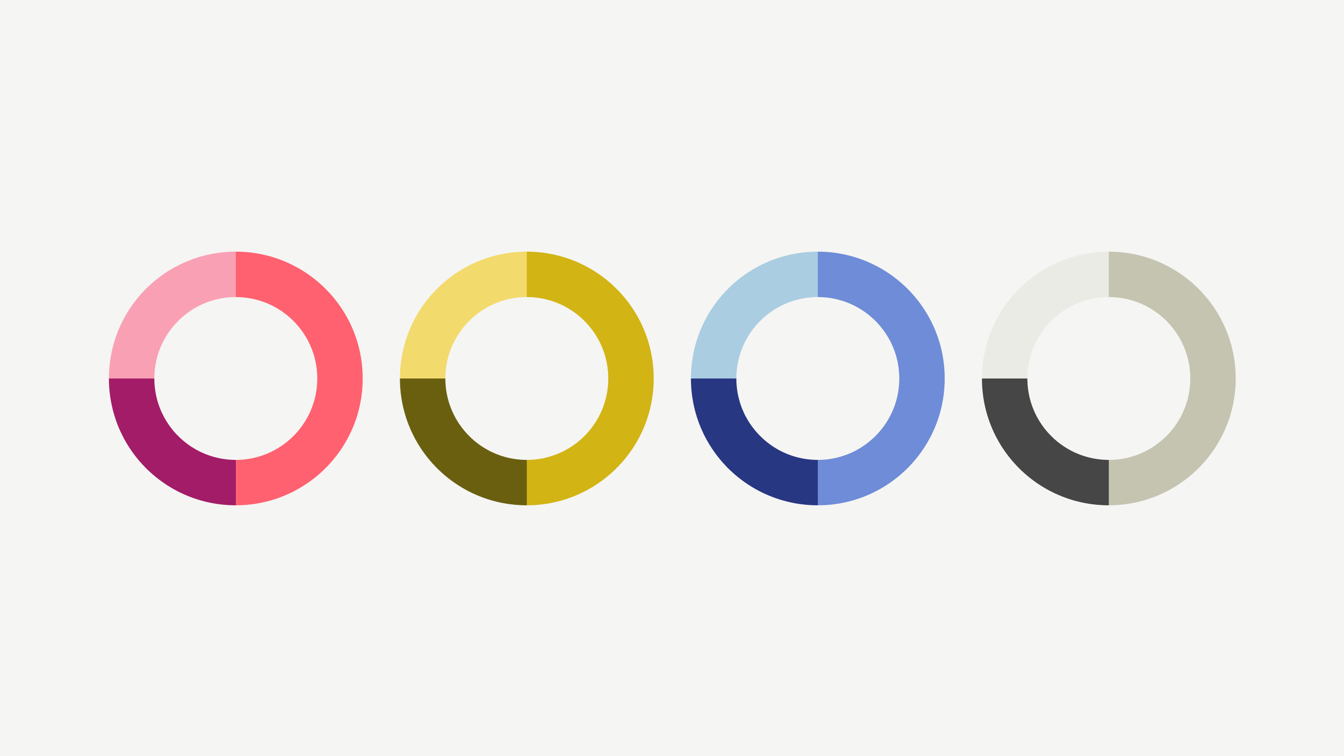
Our new color palette is a twist on primary colors, with a retro nod. Rich, vibrant, and approachable. It acknowledges the past and where we came from, while pushing the limits and bringing us into the future.
Our new logo
As we evaluated our logo, we loved how it represented multiple perspectives and interconnectivity, but we felt it was too fluid and didn’t have directionality. We wanted the updated logo to come to a precise point to represent ending in a decision. Our new logo applies the “know the unknown” concept one step further by taking the A from Alloy and rotating it at different angles. The idea being, when you look at something from different angles, it gives you a more accurate point of view.
New visual brand, same Alloy
With all these changes, we’re still the same Alloy that you’ve come to trust to handle all your fraud-fighting needs. We started six years ago as a scrappy startup, and now we’re over 100 employees. Our people make up the biggest piece of our brand identity and we wanted our new visual brand to encapsulate that. We use a lot of fun colors and shapes to break away from the mold and honor our unique culture.
Charles Hearn
Co-founder & CTO
"This new brand properly expresses the potential of Alloy to people considering using our product or joining our team. When we were making the original Alloy identity 6 years ago, we were a small team with a focused vision. Today, we are a diverse company of over 100 people across the country working on a much more ambitious mission, and we needed to create a more flexible and comprehensive brand and identity to be able to communicate all of that."
We’re excited to enter this new chapter, along with our clients and partners, to continue to look past the surface and see the full picture of your customers. Check out more of our new visual identity by exploring our website.

Bethany Walsh has spent her career working with fast-growing startups, helping them scale their marketing strategies and brand position. She spends her free time with her husband and son at the beach or playing in the backyard.


